... because naming a blog post MNY 549 just looks dumb. Why do nail polish brands do this? It doesn't even have to be a good name. Just name it anything!
Anyway, here is a polish I picked up a couple of months ago at a DM Drogerie (German drugstore chain) but this brand is also available in the Netherlands at Etos. It's a polish that immediately sparked my interest because I love a good taupe! MNY is a brand that sells affordable make-up in trendy colors for a pretty good price. The polishes cost €2,49.
It's a taupe but with purple undertones which is perfect for me because purple and taupe are my favorite colors. (Closely followed by green and blue) I have one Helmer drawer that is about 3/4 full of taupes and I have no dupes!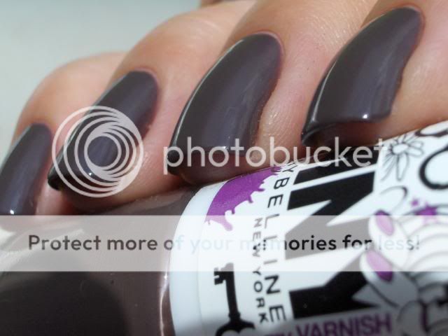
I needed four coats to get it fully opaque but I knew I would be making macro shots and macro is relentless. I think you can get away with three coats in everyday life.
I decided to do a comparison with some close colors:
Pinky: Essence LE You Rock Collection 02 Love, Peace and Purple. Four coats with topcoat.
Ring finger: Rimmel PRO 385 Hot List. Three coats with topcoat.
Middle finger: MNY 549 (See, it looks stupid with no name!) Four coats with topcoat.
index finger: OPI You Don't Know Jacques. Three coats with topcoat.
The Essence and Rimmel polishes are said to be dupes for Chanel Paradoxal. One difference between the two that I noticed irl but couldn't capture on camera is that the Rimmel one has more purple shimmer and a little, almost not noticeable, pearl shine to it which makes it look very glowy and shiny and brings out the purple shimmer more.
OPI YDKJ has more brown and grey and no purple whatsoever.
The base color on both Paradoxal dupes and MNY 549 is the same though so if you like the color but do not like shimmer polishes, this is the polish for you!
It wasn't until I was writing this blog post that I thought I should have also compared it to Models Own Purple Grey so I pulled the bottle out of my Helmer. They are nothing alike. Purple Grey is darker, a lot more purple and isn't as warm toned because it doesn't have brown or taupe in it. If I remember I'll show this to you another time.
So, that's it for today! I'm going to see if I can find some way to cool down because it's been absolutely tropical here. We're supposed to get rain and thunderstorms here tonight and I'm really looking forward to that. Maybe that will cool things down a bit.
Thanks for looking!
xoxo
Hi all!
A couple of years ago I was browsing the web and I stumbled upon this blog post by The Nailphile on the original Dorothy Who?. This is the first polish I fell in love with and it was the beginning of my love affair with nailpolish and nails. I spent the next few days reading her entire blog and when I was done I followed links to other blogs and did the same there.
You can imagine how happy I was when China Glaze announced they would bring the Wizard of Ooh Ahz Collection back! Finally I would have the chance to own this beauty myself! As soon as it came out I bought Dorothy Who? but when I saw it in person I was dissapointed. This looked nothing like the original and frankly, I think the new version is just plain ugly. It's too light and too silvery and kind of cheap-looking.
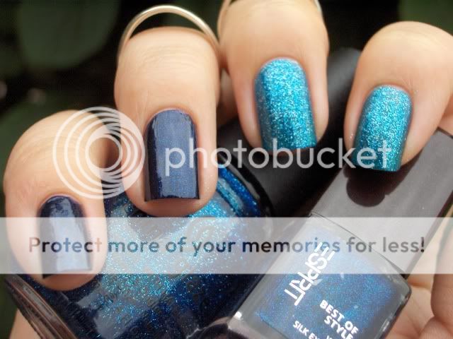
Another polish I was disappointed in was Metallic Blue by Esprit. It has an indigo base with turquoise and magenta microglitter and looks gorgeous in the bottle but on the nail the glitter won't show up as much as I would like. I bought this to kill the lemming I had for a darker blue glitter polish like Essie's Starry Starry Night but was not satisfied.
So I did the only reasonable thing to do: I frankened them!

I'm calling it Dorothy's Journey To The Stars.

It looks nothing like the original Dorothy Who? and nothing like Essie's Starry Starry Night but I love it! The different colored microglitters from Metallic Blue give it so much depth!

Unfortunately the sun wouldn't come out and play...
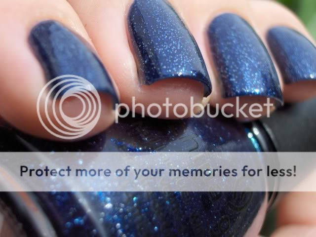
The recipe is fairly simple. I had about half a bottle of Dorothy Who? left after using if for other frankens and the Esprit polish was a 5ml mini so I just added that one to Dorothy Who? a couple of drops at a time until I was satisfied with the color which turned out to be when the entire bottle of Esprit was empty.
I think this franken needs a bit of clear polish to make a a tad more jelly and bring the glitter out more, but the bottle is full so that will have to wait until I've worn it a couple of times.
Thanks for looking!
I looooooove this manicure. I bought Forget-Me-Not for the sole purpose of mattifying it and I was right, it looks so good matte!
To see more color accurate pictures of what this polish looks like on it's own, check out these swatches from Witoxicity. For some reason my camera made this one look a lot more blue than it is irl.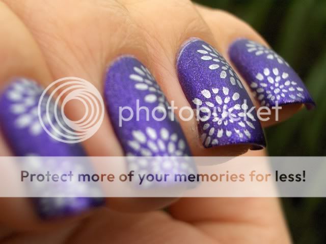
Just like we've come to expect from Catrice, this applied like a dream. I love their brush, formula and opacity! I used two coats, 1 coat of Nubar Diamont (old formula) and Catrice Nail Expert Matt Top Coat. Then I used Bundle Monster plate BM02 and China Glaze Millenium for stamping.
I'd like to say I got my blogging groove back but I don't want to jinx it. However, I'm having a lot of fun experimenting with polishes and nail-art over the past few days and it's been great to talk to all of you again!
Thanks for looking and until next time!
xoxo Kirsten
Today I'm wearing Essence Choose Me! This is apparently a dupe for Zoya Charla, OPI Catch Me In Your Net and I belief there's also an Orly polish that is a dupe. I can't compare them for you because I don't own any of those. This is definitely the cheapest of them all though so if you are looking for a budget alternative, you need this in your life!
You've probably seen better pics of this on other blogs but if you haven't I strongly recommend you google this polish. It's a stunning blue-green foil glitter polish that really looks best with a bit of sunshine on it but the sun wouldn't show itself while I was taking pics.
I've seen this polish described as a glitter but I don't agree with that description. It's very sparkly but I would describe this one as a foil. Maybe a foil glitter but not just a glitter.
This is the best pic I could take that shows some of the sparkly goodness. Those of you who own this polishes or one of it's dupes know that it's much better irl but it's impossible to capture without sunlight so this pic will have to do.
Thanks for looking and until next time!
Hi guys!
It's been a while but I have a manicure I wanted to share with you all. Recently I finally gave in and bought the Bundle Monster plates from www.bundlemonster.com and I'm glad I did! I used an image from plate BM-222 and Wet 'n Wild Black Creme for the design.
Please excuse the tipwear. I'd been wearing this mani for a couple of days before I took the pics.
This polish is from the Essence Multi Dimension line and is called Right, Girl. It's a medium red with red and gold shimmer. The gold shimmer is not very visible on the nail but it's a nice shade anyway.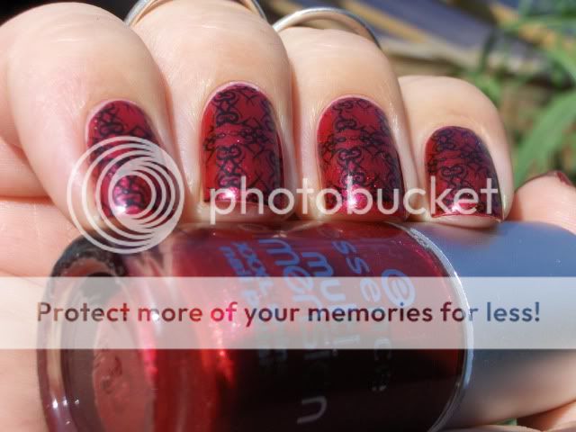
I don't own many reds (or pinks) but lately I find myself reaching for them more often so I've been expanding my pink and red stash. Do you wear reds and pinks a lot? What are your favorites?
Thanks for looking and until next time!
xoxo Kirsten
While browsing around I just found a brand of image plates I haven't heard of before. It's quite possible this is old news to all of you because I haven't really been keeping up with reading blogs but I wanted to show them to you anyway.
Apparently, Shirley, from Dashica Beauty has created her own image plates for stamping and she did so brilliantly! One thing that always bugged me with Konad is that they don't have mirror images so you can make your left and right hand the same. Shirley's plates do!
I'm borrowing these images from her site but it's free advertising so I hope she is OK with it. I'll contacted her about it and if she doesn't want me to I'll remove these.
Love the full-nail design and the fairies!
I think I need this Hello Kitty. Too cute!
Calimero! I don't know if this means anything to my international readers but there isn't one kid in the Netherlands (over 25 lol) who didn't grow up with Calimero on TV.
I really like the full-nail designs on this plate but the star is most definitely Piglet! Or maybe the little doggy with the star ball.
More Piglet!
And where would Piglet be without his good friend Pooh Bear?
More full-nail designs. I love the one on the right!
Well, I could go on and on but you get the idea. ;)
Apparently these plates are larger than the Konad or Bundle Monster plates so the full-nail designs should actually really fit your thumbs without double stamping. I haven't tried these yet but I do plan on getting some (and some Bundle Monster plates) when my tax return comes in. If any of you know these plates and have more info please let us know!
To purchase these plates, check out this blog and the accompanying webshop. The plates cost €3,75 ($5,32). I don't know if she ships internationally but considering she also blogs in English I'm guessing it should be possible.
Edit: I checked with Shirley and she does ship internationally! For shipping rates you can contact her at her blog or through her shop.
I guess you all noticed I hadn't updated in a long time and that this has been a reoccurring theme on my blog for the past months. There has been a LOT going on in blogland which has, quite frankly, taken the fun out of blogging for me for a while. I started this blog because I love nails and nailpolish and wanted to share this with anyone who was interested in reading my ramblings. Painting my nails is relaxing for me and even when my arthritis is flaring up and I can do very little else and even the most basic daily tasks are hard, fiddling around with polish is something I can do to relax and take care of myself and my appearance. Playing with colors makes me happy. Sharing this with you guys made me happy.
This blog however, stopped making me happy. It had become a big giant Thing on my ever growing To Do List of things I don't have time or energy for next to my everyday life. My heart wasn't in it anymore and painting my nails and playing with my polish became something that drained energy instead of giving it. Where blogging and polishing my nails used to be a fun addition to my life, it now was something that life got in the way of. It took me a while to realize I did that to myself.
I do not HAVE to blog, I like it. I do not HAVE to keep up with other blogs, I like it. I do not HAVE to blog solely about nails. No matter what my blog title says, it's MY blog. I do not HAVE to have to buy myself silly to get all the latest collections and quite frankly, I DON'T want to. I have no intention of ever going professional. I have no intention of ever joining any kind of bloggers union no matter how important they think they are. I do not have to get anyone's permission to post, say or do anything on my blog and no one needs to approve. I blog for me.
So, there are probably going to be some changes to my blog over the next few hours, days, weeks, months... Or not. I won't commit to anything because that takes the fun out of it for me. If you want to stick around for that; GREAT! I really appreciate you guys and the fact that you take time to read and even comment to my blogs. I can't promise I'll respond to every comment but I will read them all and please know I appreciate them.
On a positive note: I've found something else that makes me happy. I've been growing my hair out for the past two years and it's getting to a length where I can start to do fun stuff with it. I've joined a couple of long hair fora and learned a lot about haircare and ways to put your hair up and have found a new passion: making hair sticks and forks. This means you can expect the occasional post on haircare, updo's and new hair sticks and forks I made and I'll probably catalog my hair growth here too. I might even write a tutorial on how to make hair sticks if you guys are interested.
To end this Big Wall 'O Text, here are some pics of things that made me happy today:
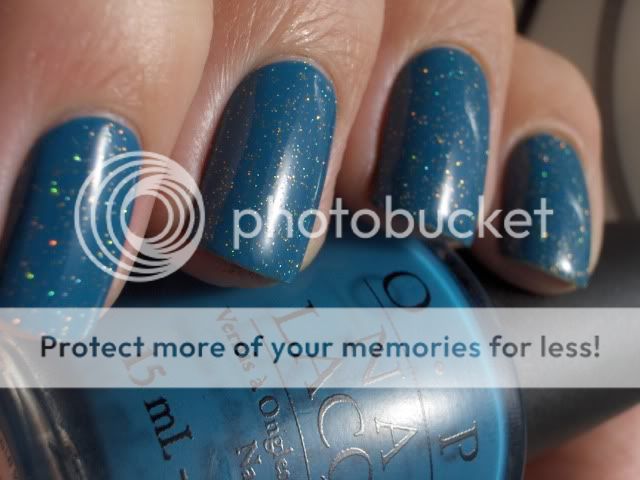
OPI Suzi Says Feng Shui with a gold colored holographic glitter called Stardust from Wet Glaze.
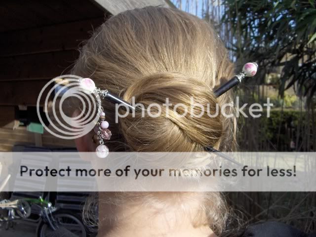
A Lazy Wrap Bun with a couple of hair sticks I made.
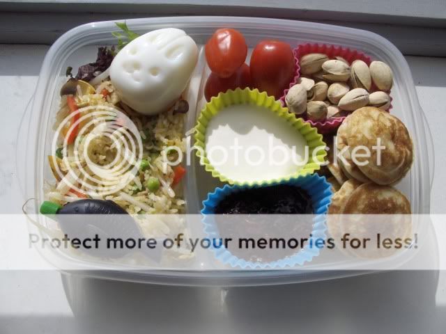
My bento lunch! Anyone who can look at a bunny-shaped egg without smiling should have his funnybone checked.
On the left: fried rice with red pepper, garlic, courgette, peas and tauge, a soy sauce fishy and a bunny-shaped egg. On the right: mini pancakes (poffertjes), clotted cream, strawberry jam, a couple of mini roma tomatoes and some pistachios. Not the healthiest of bento's but it's perfect comfort food!
ETA: My comment system is spacing out on me. Hang in there, I'll see if I can fix it!
Today I'm showing you my breast-cancer awareness manicure. I read on Delta Cephei's blog about a promotion Etos (a Dutch drugstore) is doing to raise awareness for Pink Ribbon. (www.pinkribbon.com) They ask women to paint their nails with one accent nail: a pink pinky. When you get questions about why your pinky is a different colour you can explain about Pink Ribbon and what people can do to support them. So, please take a moment to check out the links above for more information on Pink Ribbon.
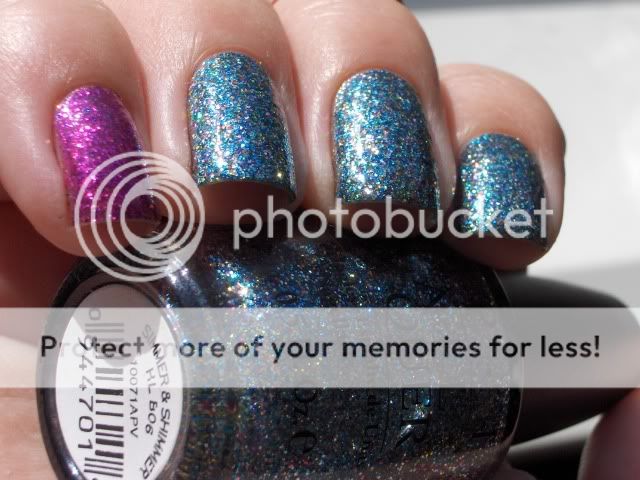
I loved this idea so I decided to use Simmer & Shimmer to do a mani myself. I used Viva la Diva #71 on my pinky.
Compared to Absolutely Alice, Simmer & Shimmer is a bit more silver and it has multi-colored glitters instead of just blue and gold. There is fuschsia, orange, yellow, green and gold which make it feel like a party in a bottle. Contrairy to what you might expect after that statement it is not an "in-your-face" glitter. Somehow OPI manages to make glitter polishes seem subdued and demure. Apart from it being glitter of course. lol
This is the sort of glitter polish I'm pretty sure wouldn't have caused my late grandmother to throw a hissyfit and kick me out of the house while yelling at me I was the whore of Babylon and believe me, my grandmother wasn't easily satisfied. Just kidding! (No I'm not.)
Anyway, back to the polish! I did four coats of Simmer & Shimmer but honestly, that fourth coat was my paranoia kicking in. Macro setting and all.... I could see some of my bare nail through it if I looked closely but from a reasonable distance the glitter took care of that. On the pinky I used two coats of Simmer & Shimmer and two coats of Viva la Diva #71 because I wanted some of the blue glitter to shine through and pull the look together.
Drying time was short as can be expected from glitters. The surface was a little bumpy after the first coat of topcoat so I added a second one to make it smooth.
Removal was normal for glitters. A pain if you try to do it the old fashioned way but with the foil method it was a breeze! I did find some stray glitters on my hands (and on my face, my hair, my couche, the floor, and on boyfriend etc. lol) but that is just the price we have to pay for wearing awesome glitters.
Thanks for looking!
Last week I got a surprise package in the mail. Two gorgeous OPI polishes from the new Burlesque Collection! With this Burlesque Collection, OPI ties in with Sony release of “Burlesque” – Christina Aguilera’s film debut in which she plays an ambitious small-town girl with a big voice who finds success in a neo-burlesque club reminiscent of the nightclub in Bob Fosse’s “Cabaret.” Featuring an all-star cast including Cher!
Not sure if I'll go see the movie but the collection contains some very nice polishes. OPI went the glitter-route again and they do it so well!
As some of you might know from reading several Dutch nail blogs the Netherlands are always a little slow when it comes to new collections. It's not unheard of for new collections to come out up to two months later here. From what I understand, the Burlesque Collection is already available in the US but in the Netherlands it will be available from the beginning of November.
Enough talk, let's go to the pictures!
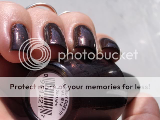
Teas-y Does It! is a vampy bordeaux polish. In the bottle the base is a sort of bordeaux and brown color with a very murky and smokey feel to it. It's filled with tiny foily flakes that flash purple, copper, gold and in some lights almost green. It seems to almost be a duochrome.
On the nail, I'm sorry to say, that multi-dimensional look doesn't quite show. You really need decent sunlight to admire this one in all it's glory. That said, it is a very pretty polish and one of my favorites from this collection. I'll definitely wear this one again!
It took me three coats to get it opaque but with careful polishing you might get away with two. Drying time is great! It was dry to the touch before I was ready to apply topcoat.Removal was also a breeze contrary to what I was expecting considering the flakies in the polish.
This polish will be available through the usual channels at the usual price. For the Netherlands this means it will be €13,95 and it will be sold at salons, Sephora, and more exclusive drugstores. For stores near you please check: www.opi.nl or www.opi.com
That's it for now! Tomorrow I'll show you Simmer and Shimmer from the same collection in a breast-cancer awareness manicure. Thanks for looking!
There is a first for everything... ;)
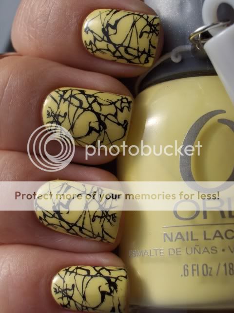
I love the look of yellow polish but usually not on me however this polish might be the first that didn't give my skin that sick look so I love it! This is Orly Lemonade from the Orly Sweet Collection that came out last spring or summer, I'm not sure. It's a collection of gorgeous pastels that are all surprisingly opaque in very few coats.
Yellow is notorious when it comes to coverage but this one was opaque in three thin coats so I'm impressed! I also love the Orly formula, brush and ofcourse the big bottles and rubber handle for easy grip. They may not be the prettiest but the are very functional.
Yellow is such a happy color! I did feel the need to spice it up a bit with a full-nail Konad print. I used plate M70 and Konad Special polish in Black which I bought at www.enchantra.eu. You can buy Konad supplies, China Glaze and other nailpolishes there at a 15% discount using the code DTCHNLBLG. They ship everywhere in Europe!
If you think you can see darker yellow spots on my nails, your eyes are not deceiving you. My first idea was to stamp this design in a darker yellow but it didn't stand out enough to make an impression so I wiped it off with a quick swipe with a felt square and pure acetone but it seems I missed some. What can I say, I only have time to paint my nails at night and it was to dark to see clearly. lol












.JPG)


21