

... because naming a blog post MNY 549 just looks dumb. Why do nail polish brands do this? It doesn't even have to be a good name. Just name it anything!
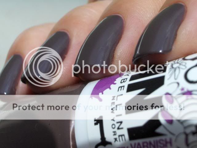
Anyway, here is a polish I picked up a couple of months ago at a DM Drogerie (German drugstore chain) but this brand is also available in the Netherlands at Etos. It's a polish that immediately sparked my interest because I love a good taupe! MNY is a brand that sells affordable make-up in trendy colors for a pretty good price. The polishes cost €2,49.
It's a taupe but with purple undertones which is perfect for me because purple and taupe are my favorite colors. (Closely followed by green and blue) I have one Helmer drawer that is about 3/4 full of taupes and I have no dupes!
I needed four coats to get it fully opaque but I knew I would be making macro shots and macro is relentless. I think you can get away with three coats in everyday life.
I decided to do a comparison with some close colors:
Pinky: Essence LE You Rock Collection 02 Love, Peace and Purple. Four coats with topcoat.
Ring finger: Rimmel PRO 385 Hot List. Three coats with topcoat.
Middle finger: MNY 549 (See, it looks stupid with no name!) Four coats with topcoat.
index finger: OPI You Don't Know Jacques. Three coats with topcoat.
The Essence and Rimmel polishes are said to be dupes for Chanel Paradoxal. One difference between the two that I noticed irl but couldn't capture on camera is that the Rimmel one has more purple shimmer and a little, almost not noticeable, pearl shine to it which makes it look very glowy and shiny and brings out the purple shimmer more.
OPI YDKJ has more brown and grey and no purple whatsoever.
The base color on both Paradoxal dupes and MNY 549 is the same though so if you like the color but do not like shimmer polishes, this is the polish for you!
It wasn't until I was writing this blog post that I thought I should have also compared it to Models Own Purple Grey so I pulled the bottle out of my Helmer. They are nothing alike. Purple Grey is darker, a lot more purple and isn't as warm toned because it doesn't have brown or taupe in it. If I remember I'll show this to you another time.
So, that's it for today! I'm going to see if I can find some way to cool down because it's been absolutely tropical here. We're supposed to get rain and thunderstorms here tonight and I'm really looking forward to that. Maybe that will cool things down a bit.
Thanks for looking!
xoxo



I guess you all noticed I hadn't updated in a long time and that this has been a reoccurring theme on my blog for the past months. There has been a LOT going on in blogland which has, quite frankly, taken the fun out of blogging for me for a while. I started this blog because I love nails and nailpolish and wanted to share this with anyone who was interested in reading my ramblings. Painting my nails is relaxing for me and even when my arthritis is flaring up and I can do very little else and even the most basic daily tasks are hard, fiddling around with polish is something I can do to relax and take care of myself and my appearance. Playing with colors makes me happy. Sharing this with you guys made me happy.
This blog however, stopped making me happy. It had become a big giant Thing on my ever growing To Do List of things I don't have time or energy for next to my everyday life. My heart wasn't in it anymore and painting my nails and playing with my polish became something that drained energy instead of giving it. Where blogging and polishing my nails used to be a fun addition to my life, it now was something that life got in the way of. It took me a while to realize I did that to myself.
I do not HAVE to blog, I like it. I do not HAVE to keep up with other blogs, I like it. I do not HAVE to blog solely about nails. No matter what my blog title says, it's MY blog. I do not HAVE to have to buy myself silly to get all the latest collections and quite frankly, I DON'T want to. I have no intention of ever going professional. I have no intention of ever joining any kind of bloggers union no matter how important they think they are. I do not have to get anyone's permission to post, say or do anything on my blog and no one needs to approve. I blog for me.
So, there are probably going to be some changes to my blog over the next few hours, days, weeks, months... Or not. I won't commit to anything because that takes the fun out of it for me. If you want to stick around for that; GREAT! I really appreciate you guys and the fact that you take time to read and even comment to my blogs. I can't promise I'll respond to every comment but I will read them all and please know I appreciate them.
On a positive note: I've found something else that makes me happy. I've been growing my hair out for the past two years and it's getting to a length where I can start to do fun stuff with it. I've joined a couple of long hair fora and learned a lot about haircare and ways to put your hair up and have found a new passion: making hair sticks and forks. This means you can expect the occasional post on haircare, updo's and new hair sticks and forks I made and I'll probably catalog my hair growth here too. I might even write a tutorial on how to make hair sticks if you guys are interested.
To end this Big Wall 'O Text, here are some pics of things that made me happy today:
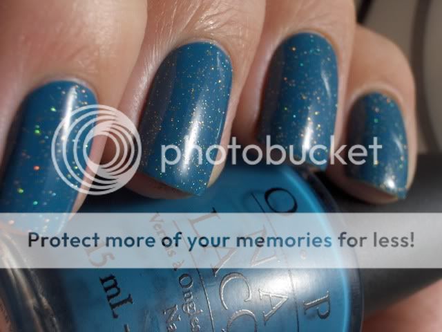
OPI Suzi Says Feng Shui with a gold colored holographic glitter called Stardust from Wet Glaze.
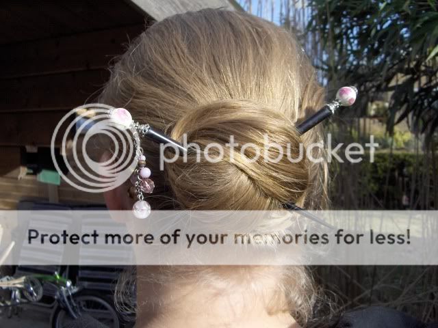
A Lazy Wrap Bun with a couple of hair sticks I made.
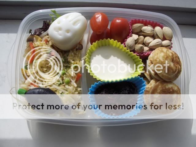
My bento lunch! Anyone who can look at a bunny-shaped egg without smiling should have his funnybone checked.
On the left: fried rice with red pepper, garlic, courgette, peas and tauge, a soy sauce fishy and a bunny-shaped egg. On the right: mini pancakes (poffertjes), clotted cream, strawberry jam, a couple of mini roma tomatoes and some pistachios. Not the healthiest of bento's but it's perfect comfort food!
ETA: My comment system is spacing out on me. Hang in there, I'll see if I can fix it!
There is a first for everything... ;)
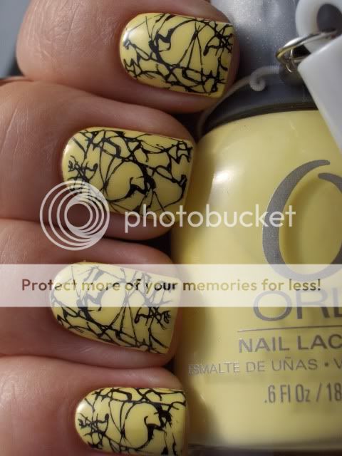
I love the look of yellow polish but usually not on me however this polish might be the first that didn't give my skin that sick look so I love it! This is Orly Lemonade from the Orly Sweet Collection that came out last spring or summer, I'm not sure. It's a collection of gorgeous pastels that are all surprisingly opaque in very few coats.
Yellow is notorious when it comes to coverage but this one was opaque in three thin coats so I'm impressed! I also love the Orly formula, brush and ofcourse the big bottles and rubber handle for easy grip. They may not be the prettiest but the are very functional.

Yellow is such a happy color! I did feel the need to spice it up a bit with a full-nail Konad print. I used plate M70 and Konad Special polish in Black which I bought at www.enchantra.eu. You can buy Konad supplies, China Glaze and other nailpolishes there at a 15% discount using the code DTCHNLBLG. They ship everywhere in Europe!
If you think you can see darker yellow spots on my nails, your eyes are not deceiving you. My first idea was to stamp this design in a darker yellow but it didn't stand out enough to make an impression so I wiped it off with a quick swipe with a felt square and pure acetone but it seems I missed some. What can I say, I only have time to paint my nails at night and it was to dark to see clearly. lol
Hi there! Eyeko came out with two new polishes called Rain and Saucy and they were kind enough to send me some for review. I actually wore Saucy yesterday but didn't get around to posting it so I'm showing you both today.
If you read my blog regularly you might have noticed I'm not really a red fan and I hate to swoon over a polish I received for review like this because it seems disingenuous but this really is the perfect red. It actually made my heart skip a beat when I opened the package. It's THAT beautiful! I may have found a HG red creme; something I never expected to find because red is just not me. Judge for yourself...
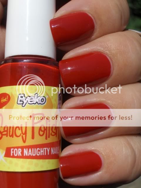
*Swoon* Isn't it gorgeous?! I know other bloggers said it was a one-coater for them but I definitely needed two coats to get it nice and even. Not that I mind though, I'm not fond of one-coaters anyway. I always do a second coat with polishes like that unless I want to layer it.
I really enjoyed wearing this polish as it is but still couldn't leave it alone so yesterday afternoon I stamped it with a patern from an Essence plate to give it a bit of an Asian look. I can't tell you the number for the plate because I bought four different plates and they were only marked #1 and #2. This one had a #1 on it but because I had two different #1 plates I named this one #1A.
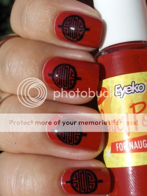
I'm really happy with how this turned out! It made me want to dress my hair up with chopsticks and eat Chinese food. Which of course I did. I made Kung Pao chicken for diner. Yum!
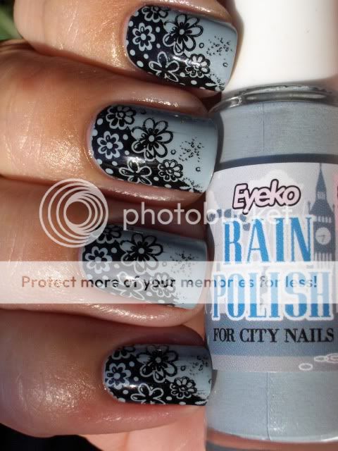
Today I'm wearing Rain. A blue-toned grey with a secret silver shimmer that is visible in the bottle but not so much on my nails. Weird because I've seen pictures from other that clearly show the subtle shimmer.
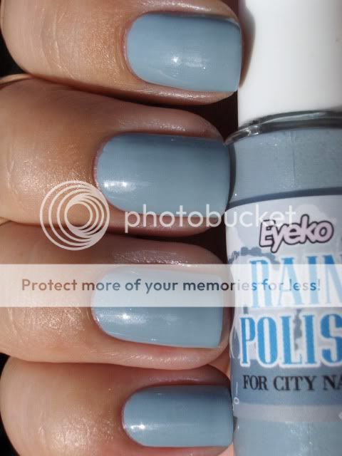
I had a bit more trouble with this one. Not horrible but like most pastels and lighter colours it has a tendency to get goopy so after the second coat I added a couple of drops of thinner to fix that.
Because I love my new nubbins so much and the Konad full-nail plates finally fit, I decided to stamp this one with a patern from plate M74. I've never been able to use this plate because it annoys me when slanted paterns don't cover half my nails but now they do.
I might keep this on for more than one day but if not I have a lilac-purple-white plaid mani planned for tomorrow.
Thanks for looking!
Oh and if you hate me for writing this post in English only, feel free to yell at me in the comments. It's too hot to translate posts right now and I always have to cut half off my posts to prevent the dreaded wall 'o text when I write them bilingual so I'm giving English-only a try. It might even be permanent depending on your much or how little I get yelled at.
Eyeko is sold for £3.50 a piece at www.eyeko.com but you can also buy sets. Check out their site for more info.
Mijn laatste blogpost is al een tijdje geleden maar ik ben niet toegekomen aan bloggen doordat ik druk was met tentamens en de nieuwe pup. Maar het is zomervakantie nu dus ik heb tijd om het in te halen. Bedankt dat jullie toch zijn blijven plakken!
Ik heb niet van alle NOTD's van de laatste tijd foto's kunnen maken maar ik heb er wel een aantal voor jullie.
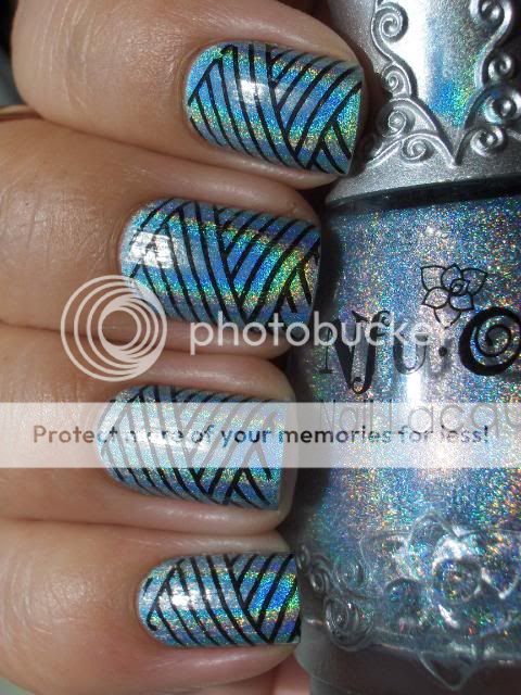
Laat ik maar beginnen met mijn NOTD van vandaag. Ik heb mijn nagels kort gevijld en ik vind het eigenlijk wel mooi dus ik denk dat ik ze een tijdje zo houd. Het voordeel is ook dat de Konad full-nail plates nu op bijna al mijn nagels passen behalve mijn ringvingernagel maar de ruimte die overblijft is klein dus dat vind ik niet erg.
Ik heb Nfu Oh #65 gebruikt met Konad plate S06 en Wet 'n Wild Black Creme voor het stempelen.
Let's start with my NOTD from today. I filed my nails down to nubbins and I actually like the style so I think I'll keep them this way for a while. The good thing about this is the Konad full-nail plates will actually fit all my nails except my ringfinger nails now, but the remaining gap on my ringfinger nail is so small it doesn't bother me.
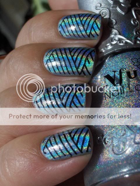
Nfu Of maakt de beste holo's! Ze zijn belachelijk schitterend, glanzend en makkelijk om mee te werken, daarnaast zijn de flesjes prachtig. Als ik een snelle zomerse manicure wil grijp ik altijd naar de Nfu Oh holo's omdat ze zo snel drogen. Het zijn eigenlijk matte lakken maar omdat de holo zo enorm sterk is valt dat haast niet op.

En dan nu de reden dat ik weinig foto's heb kunnen posten...
And now the reason I couldn't post as much...

Ziet er onschuldig uit hè?
Looks innocent right?


Fout! Het is een nagellak-etend monster! Ik weet niet meer welke lak de eerste was maar het heeft het maar een paar uur gered. De tweede foto is Color Club Wild At Heart.
En hij vind het leuk om me te helpen om swap pakketjes uit te pakken.
And he likes to help me unpack swap packages.

Maar dan gaat hij weer nagellak jatten...

Op mijn nagels zit hier OPI Who The Shrek Are You?
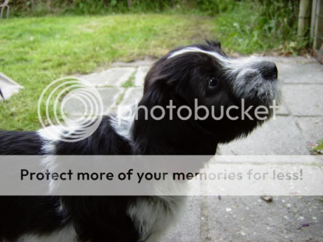
Maar hij kan ook lief zijn...

Dat was het weer voor vandaag. Bedankt voor het kijken en ik beloof dat ik jullie niet weer zo lang zal laten wachten!
That is it for today. Thanks for looking and I promise I won't keep you waiting this long again!
lol sorry, ik ben gewoon helemaal weg van deze combinatie! Helaas ben ik vergeten om de Eyeko alleen op de foto te zetten maar de kleur spreekt voor zichzelf denk ik. Hoe kan je nou niet van taupe houden?!

Dit is drie laagjes Eyeko Posh Polish met een laagje Essence Nail Art Twins Glitter Topper Louise en Nubar Diamont.

Had ik al gezegd dat ik helemaal weg ben van deze combo? Als er niet een hoekje van mijn duimnagel geknapt was vanmiddag toen ik mijn tas op mijn fiets aan het binden was had ik deze wel een paar dagen gedragen. Ik heb mijn nagels wat korter moeten vijlen om bij de duim te passen maar dat is wel OK. Ik heb een druk weekend voor de boeg en kortere nagels zijn wat praktischer.
Eyeko Posh Polish is mij toegestuurd voor review door Eyeko.
Eyeko Posh Polish was sent to me for review by Eyeko.

Dit is Eyeko Vintage Polish Jade Green en

Ik was er zo blij mee dat ik de Konad en de nail-art spullen tevoorschijn heb gehaald. Ik heb gestempeld met Sally Hansen Grape Going en het vlinderpatroon van plate M16. Daarna heb ik een bloemetje met een duochrome effect toegevoegd. De bloemen weerschijnen groen en blauw als het licht er op valt. Daarna heb ik Nubar Diamont gebruikt om alles mooi te laten glanzen en de bloemen op hun plaats te houden.
Deze lak heeft niet de platte kwastjes die ik prettig vind maar ik had geen problemen met aanbrengen. De formule is goed. Ik had drie laagjes nodig om het dekkend te krijgen wat normaal is voor mij, zeker aangezien dit een pastelkleur is. Het enige nadeel dat ik tot nu toe heb ontdekt met dit merk is het formaat van de flesjes. (8.5 ml).
Ik ben op dit moment de inschrijvingen voor mijn winactie aan het tellen en ik hoop vanavond de winnaar aan te kunnen kondigen. Helaas heb ik een aantal inscrijvingen moeten diskwalificeren omdat ze niet aan de regels voldeden. Niet leuk om te doen dus voor mijn volgende winactie ga ik het een stuk simpeler maken. Ik dacht dat de regels nu al niet zo ingewikkeld waren maar blijkbaar heb ik me vergist.Ik wil dat mijn winacties leuk en makkelijk zijn en geen doolhof van opdrachten en regels dus de volgende keer gooi ik alle regels eruit!
Catrice heeft ons niet alleen een geweldige core line gegeven maar ze blijven ook nog steeds erg mooie (en erg beperkte) limited editions uitbrengen. De meest recente is Oceana.
Niet alle kleuren in deze collectie horen bij het thema vind ik maar wat maakt het uit. Wat wel leuk is, is dat deze collectie twee matte lakjes heeft en dat de kwaliteit erg goed is!
Op naar de swatches.

Pebble Beach, a zachte lichtgrijs. Dit is mijn favoriet uit deze collectie! De finish is meer satijnachtig dan mat maar dat past bij deze kleur ook wel heel erg goed. Dit is twee laagjes en de dekking was erg goed. De formule was prettig om mee te werken omdat deze niet, in tegenstelling tot sommige andere matte lakjes, haast op het kwastje al droog is.
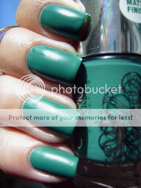
Sea Of Green. Deze mooie turquoise is ook weer meer satijnachtig dan mat en is een goede tweede favoriet. Mooi! Ook deze was dekkend in twee laagjes en droogde eenmaal op de nagel redelijk snel. Dat is altijd erg prettig aan matte lakken. Bij cremes vind ik een satijnachtige finish ook mooier dan echt mat.

Ik hoor om me heen dat dit een matte versie van I Sea You van Catrice zou zijn maar dat is zoals je ziet niet het geval! Om de vergelijking qua kleur goed te kunnen maken heb ik over beide een topcoat gedaan. Op mijn wijsvinger en ringvinger zit I Sea You en op mijn middelvinger en pink Sea Of Green. Zoals je ziet is Sea Of Green donkerder dan I Sea You.
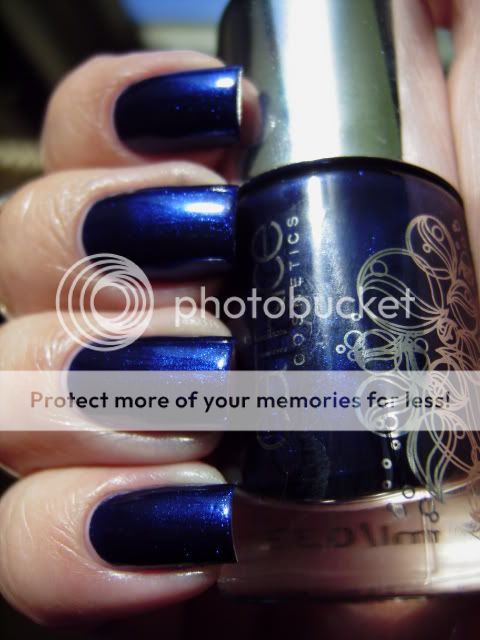
De volgende is Blue Out To Sea. Een donkerblauwe shimmer. Niet heel uniek maar wel mooi. De kobaltblauwe shimmer geeft deze lak net even wat meer diepte.

De laatste is Ocean Sunset. Ik zal er maar gelijk bij vertellen dat deze foto absoluut niet kleurecht is. Als ik alleen deze wilde laten zien had ik de foto niet geplaatst maar omdat ik de hele collectie laat zien wilde ik hem er toch bij doen. Deze lak is niet oranje maar echt brandweerwagenrood! Een prachtige rode jelly die ook weer niet heel uniek is maar als je nog geen rode jelly hebt dan is dit een erg prettige!
Op de foto draag ik twee laagjes zonder basecoat of topcoat.
Dat was het weer voor vandaag! Bedankt voor het kijken en dat jullie zo geduldig met me zijn geweest toen ik afwezig was.
Vandaag dan eindelijk de andere lak die ik voor review gekregen heb uit de OPI Shrek collectie: Ogre The Top Blue.
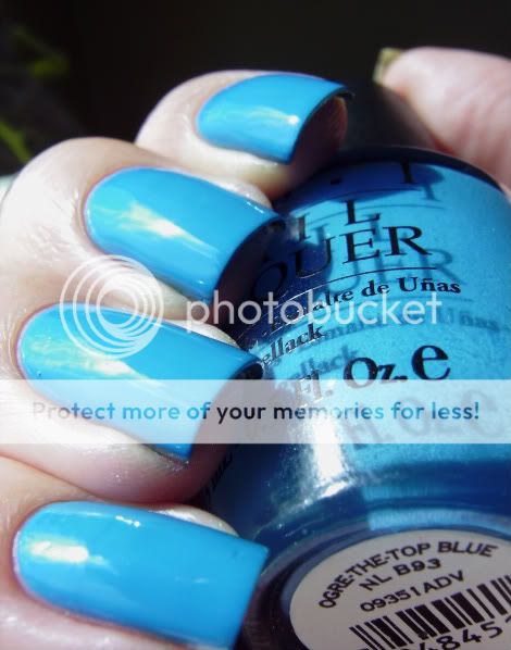
Een mooie, heldere middenblauwe creme. Omdat de formule wat dun en streperig is had ik drie laagjes nodig om deze dekkend te krijgen. De kleur is niet heel uniek volgens mij maar ik ben nog niet op zoek gegaan in mijn stash naar vergelijkingsmateriaal. Mocht ik nog een dupe tegenkomen dan laat ik dat jullie zeker weten!
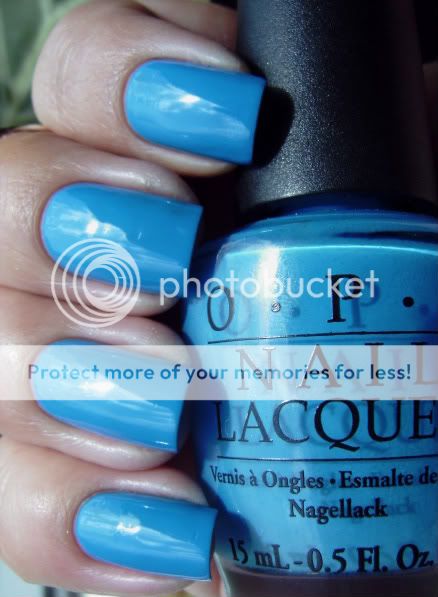
Sorry voor de matige kwaliteit van mijn foto's. Mijn camera is stuk waardoor ik op mijn back-up aangewezen ben die helaas niet zulke mooie foto's maakt. Ik ben aan het bekijken of ik qua budget beter mijn camera kan laten maken of een nieuwe kan kopen.
Bedankt voor alle inschrijvingen op mijn giveaway! Het zijn er meer dan ik verwacht had dus het kan even duren voor ik ze allemaal het uitgezocht. Zodra ik alle inschrijvingen nagekeken heb laat ik www.random.org of een vergelijkbaar programma de winnaar bepalen.
I'm sorry for the poor quality of my pics. My camera broke down so I have to use my back-up which doesn't really make nice pictures. I'm looking into having my camera fixed or buying a new one depending on the cost.
Heel erg bedankt aan iedereen die hun beste wensen en felicitaties heeft gestuurd voor ons huwelijk. We hebben een fantastische dag gehad! We hebben wat tijd genomen om te genieten na de bruiloft maar ik zal ergens in de komende week weer normaal gaan posten.
Thanks to everyone who sent their best wishes and congratulations for our wedding. We had a great day! We've taken some time to enjoy our post-wedding days but I should be back to regular posting somewhere in the next week.

Dusss eerst de swatch is ik al dagen beloofd heb. OPI Nederland heeft mij twee lakken uit de nieuwe OPI Shrek Collection gestuurd voor review. Dit is Rumple's Wiggin', die gebaseerd is op een nieuw karakter uit de volgende Shrek film.
Sorry voor de zwarte stipjes, Ik had wat bubbeltjes in mijn topcoat die irl niet echt te zien zijn maar blijkbaar op de foto zwart lijken.

Iedereen die mijn blog regelmatig leest weet dat ik paars bijna net zo mooi vind als modderkleuren en deze is geen uitzondering. Het is een heel mooie lavendelkleurige pastel die net een beetje warmer van kleur is dan China Glaze Light As Air. Wat kleur betreft vind ik deze mooier omdat deze niet het typ-exeffect heeft op mij.
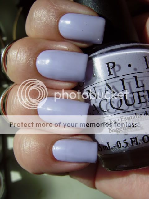
Ondanks dat ik erg houd van een goede paarse pastel was ik een beetje teleurgesteld in de dekking van deze. Ik had drie laagjes nodig om het dekkend te krijgen en op sommige nagels zelfs vier. De formule is wel erg prettig om mee te werken maar ik zou hem liever iets gepigmenteerder zien. Desondanks ben ik helemaal weg van deze!

Daarnaast heb ik nog een pupdate. We gaan de leuke tijd in nu alle ogen en oren open zijn en ze beginnen te lopen, grommen, blaffen en spelen. Het is zo'n grappig en schattig gezicht als ze per ongeluk blaffen en dan in paniek raken omdat ze iets engs gehoord hebben! lol
We hebben besloten om een van de reutjes te houden omdat deze nu al als twee druppels water lijkt qua karakter en ondeugendheid. Die links bovenaan richting de hand loopt is onze Wammes.

Als je je nog niet hebt ingeschreven voor mijn Surprise Puppy Giveaway doe dat dan snel! Je kunt negen Catrice lakjes naar eigen keuze winnen en misschien zelfs een puppy een naam geven! De giveaway is open voor idereen, overal ter wereld!
Please remember to enter my Surprise Puppy Giveaway if you haven't already to win nine Catrice polishes of your choice and maybe you even get to name a puppy!The giveaway is open to everyone, anywhere in the world!
That's it for today. Thanks for looking!
Ben je al die Catrice lakjes al zat? Jammer dan want er zijn er nog veel meer!

Dit is From Dusk To Dawn, een erg mooie taupe die precies tussen Sephora by OPI Metro Chic en China Glaze Channelesque ligt. Een beetje paarser dan Channelesque, een beetje minder dan Metro Chic. Ze hebben wel bijna dezelfde kleurdiepte. (Ik zal later een vergelijking doen waar ook Catrice Lost In Mud bij zal zitten)

Ik houd van modderige kleuren! Iemand zei vandaag tegen me dat deze niet erg lente-achtig was. Ik vind taupe gewoon een pastel bruin en niets is meer geschikt voor de lente dan pastels, dus. *steekt tong uit*
Ik heb volgens mijn statistieken vandaag ineens heel veel bezoekers via www.forum.hr. Welkom! Kan iemand het directe linkje aan me geven van de post op dat forum? Ik vind het altijd wel leuk om te zien waar mijn bezoekers vandaan komen. Bedankt!
Nog een Catrice uit de nieuwe collectie waarvan je er een aantal kunt winnen bij mijn giveaway. Deze moest ook weer behoorlijk verdunt worden maar verdorie wat ben ik gek op die platte, korte Catrice kwastjes! Ze maken het zo makkelijk om de lak onder controle te houden.
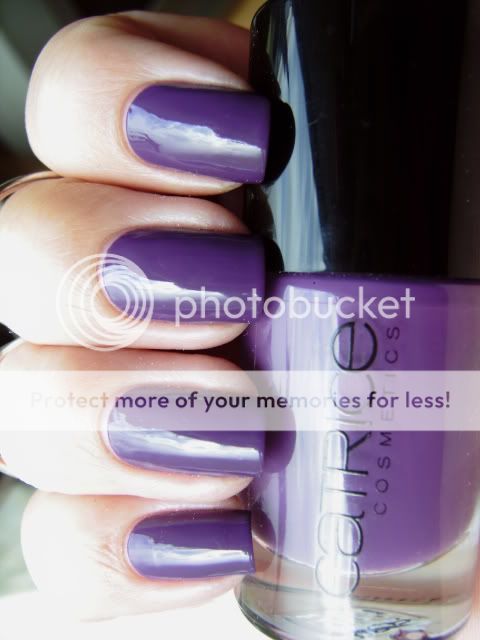
Plum Play With Me is qua kleur niet echt speciaal maar ik houd wel van een goede paars en ik heb geen exacte dupes in mijn collectie dus ik ben er erg blij mee! In het echt is deze een beetje roder maar helaas pakt deze camera paars niet echt goed op.
Let's Talk About Barrie is een mooie berry-kleurige jelly. Prachtige kleur! Niet te rood, niet te roze, ik ben er helemaal weg van!
Ik had drie laagjes nodig om deze helemaal dekkend te krijgen maar als je geen problemen hebt met een beetje VNL (Engelse afkorting voor zichtbare nagellijn of visible nail line) dan is twee laagjes genoeg om een mooie finish te krijgen. Ik had met deze geen problemen met de formule. De lak werkte erg prettig, wat te verwachten is van een jelly.
Let's Talk About Barrie is a very nice berry-coloured jelly. Beautiful colour! Not too red, not too pink, I absolutely love it!
It took tree coats to be perfectly opaque but if you don't mind a little VNL (visible nail line) two are enough to get a nice finish. I've had no trouble with this one formula-wise. The consistency was very nice to work with as can be expected from a jelly.
Ik laat mijn linkerhand zien omdat mijn rechter een aantal flinke chips had na anderhalve dag dragen. Ik ben wel aardig hard geweest voor mijn nagels maar het is alsnog een beetje een teleurstelling. Ik heb ook wat vreemde krimp gehad op sommige vingers zoals je op mijn ringvinger kan zien maar daarvan geef ik Diamont de schuld.
Ik heb ook besloten om in het vervolg verticale foto's te posten in plaats van horizontale. Ik weet dat een aantal van jullie liever horizontale zien maar blogger cropt die foto's op een vreemde manier waardoor mijn handen en nagels er vreemd smal en uitgerekt en dat vinnik nie loik dus ik ga verticaal!
Reminder: Als je deze kleur wilt winnen schrijf je dan in voor mijn giveaway!
I'm showing you my left hand because my right had a couple of bad chips after only a day and a half of wear. I've been pretty rough on my hands but it's still a bit disappointing. I've also had some weird shrinking on some fingers as you can see on my ring finger but I blame Diamont for that.
I've also decided I'm going to post vertical pics from now on instead of horizontal ones. I know some of you told me you prefer horizontal but somehow those pics are cropped a a weird way which makes my hands and nails look weirdly thin and stretched and me no likey so I'm going vertical from now on!
Reminder: If you want to win this colour you should enter my giveaway!
-EDIT-
Ik ben vergeten om een puppy update te doen!
Wij denken er serieus over na om het bonte reutje te houden dat rechtsboven met zijn kont uit de groep steekt en mijn zus wil twee teefjes houden. Hopelijk vinden we op tijd baasjes voor de overige pups maar dat zal wel lukken. Wie wil er nou niet zo'n hummel? ;)
I forgot to do a puppy update!
We're seriously thinking about keeping the white and black male pup that sticks his butt out of the group on the top right and my sister want's to keep two of the bitches. I hope we can find new owners for the rest of them but that shouldn't be a problem. Who wouldn't want to have one of these? ;)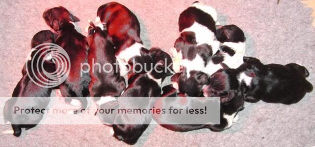


Ik weet niet waarom maar de laatste tijd grijp ik steeds naar mijn groenen als ik een mani wil doen. Als je in kleurentherapie gelooft staat groen voor zelfrespect, balans en harmonie en heeft het een kalmerend effect. Ik weet niet wat ik daarvan moet vinden maar gezien de hectische tijd waarin ik zit kan ik alle hulp gebruiken dus ik omarm de groen.
I don't know why but lately I find myself reaching for greens almost every time I do a mani. If you believe in colour therapy green stands for self-respect, balance and harmony and has a calming effect. I'm not really sure about that but considering the hectic times I'm in I can use all the help I can get so I'm embracing the green.
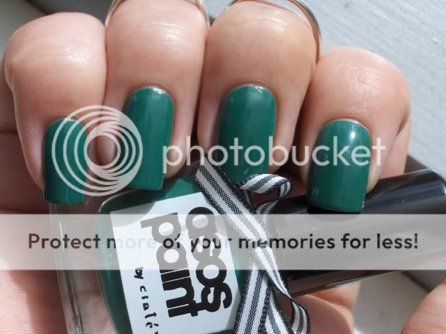
Dit is Asos by Ciaté Pixie, een prachtige groene creme. Deze foto is genomen na drie dagen dragen waarin ik aardig hard voor mijn handen ben geweest en zonder dat ik de topcoat ververst heb dus ik ben onder de indruk van de draagtijd!
This is Asos by Ciaté Pixie, a gorgeous apple green creme. This picture was taken after three days of wear while being pretty rough on my hands and without topcoat refreshments so I'm impressed with the wear time!
Ik had drie laagjes nodig om deze dekkend te krijgen. Over de formule is niet veel te zeggen, deze is niet opmerkelijk goed of slecht en hetzelfde geldt voor het kwastje.
Ik ben helemaal gek van deze kleur! IceRozie heeft me deze voor mijn verjaardag in Februari gegeven en ik ben er heel blij mee. Wat ik vooral erg mooi vind is dat ze helder maar toch een beetje stoffig is. Heel interessante lak!
Ik ben heel benieuwd hoe deze zich laat vergelijken met OPI Jade Is The New Black maar die heb ik nog niet binnen. Zodra ik die heb zal ik een vergelijking maken.
I needed three coats to get it opaque. Formula-wise there isn't much to say, it isn't remarkably good or bad and the same goes for the brush.
I really love this colour! IceRozie gave me this one for my birthday in February and I'm so glad she did. I love that it is very bright yet just a little bit dusty. Very interesting polish!
I'm very curious to see how it compares to OPI Jade Is The New Black but I don't have that one yet. As soon as I do I'll make a comparison.

Ik heb een relatief nieuw merk voor jullie vandaag waar ik erg enthousiast over ben! Cheeky Monkey Cosmetics heeft mij een aantal lakjes gestuurd voor review. En ondeugend zijn ze!
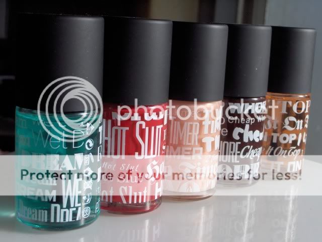
Kijk hoe lief de verpakking is!
I have a fairly new brand to show you today that I'm pretty excited about! Cheeky Monkey Cosmetics was kind enough to send me some polishes for review. Cheeky is the right word!
Look a how cute the packaging is!
Ik vind het zo grappig dat de F'N op de sticker censureren maar hun lakjes wel namen als Hot Slut of Wet Dream geven. lol
Deze lakjes heb ik gekregen:
I love how they censor F'N on the sticker but do name their polishes Hot Slut or Wet Dream. lol
These are the polishes I got:
Wet Dream (basecoat), I Like It On Top (topcoat), Hot Slut (zachtrood met een blauwe ondertoon), Two Timer (iridescent oranje-roze sheer) en Cheap Whore (diep robijnrood).
Aan alle flesjes zitten kleine 'motivational' kaartjes zoals deze:
Wet Dream (basecoat), I Like It On Top (topcoat), Hot Slut (soft red with a blue undertone), Two Timer (iridescent orangey pink sheer) and Cheap Whore (deep ruby red).
All the bottles come with cute little 'motivational' notes like these attached:
De eerste is Two Timer. Een sheer oranje-roze. Dit zijn twee laagjes. De kleur komt op de foto niet helemaal over maar op mijn middelvinger en wijsvinger kan je onderaan de gekleurde glans zien. Ik ben niet zo'n fan van sheers maar deze kon wel eens erg mooi zijn over zwart.
The first one is Two Timer. A sheer orange-pink. This is two coats. The colour doesn't really show in the pic but on my middle finger and index finger you can see the coloured shine. I'm not a big fan of sheers but this one could be very pretty over black.
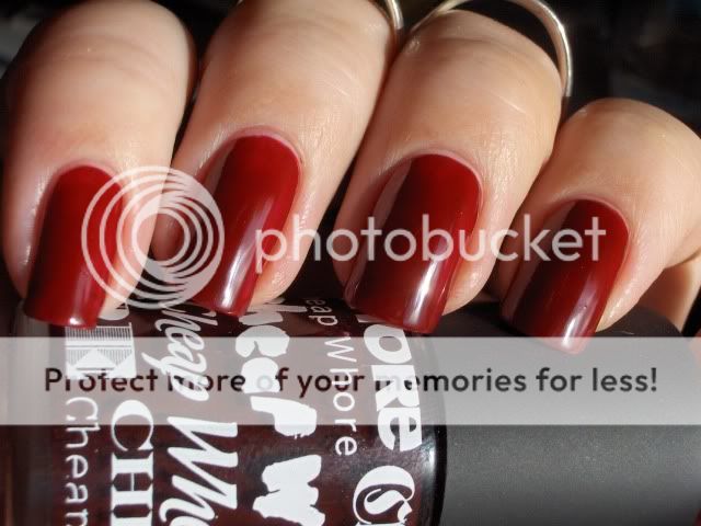
De volgende is Cheap Whore, een robijnrode jelly-achtige lak. Dit is drie laagjes zonder topcoat. Het zag er in het echt perfect uit maar macro is medogenloos en ik zie dat een extra laagje geen kwaad had gekund. Ik houd van deze kleur! Het is rood maar niet in-your-face-rood. Ik vind deze eigenlijk best wel stijlvol ondanks de naam. ;)
Next up is Cheap Whore, a deep ruby-red jelly-like polish. This is three coats without topcoat. It looked great irl but macro is ruthless and I see an extra coat wouldn't have hurt. I love this colour! It's red but not in-your-face-red. I think it's actually quite classy despite the name. ;)
Hot Slut is een adenbenemende rood. Helaas raakt mijn fototoestel van slag van knalrode nagellak dus de foto's zijn helemaal niet kleurecht. In het echt is Hot Slut een knalrood met blauwe ondertonen in plaats van oranje ondertonen zoals de foto laat zien.
Hot Sluti's a breathtaking red. Unfortunately my camera freaks over bright red polish so the pics arent colour accurate at all. In real life Hot Slut is a bright red with blue undertones instead of orange ones like the pic shows.
Het zonlicht verdween terwijl ik aan het konadden was maar ik wilde jullie toch laten zien wat ik er mee gedaan heb.
I lost daylight while konadding but I wanted to show you what I did with it anyway.
Ik kon het niet laten om hier wat 'slutty' Konad aan toe te voegen met de fishnet en kant patronen van plate M57.
I just couldn't help myself and had to add a little slutty Konad using the fishnet and lace designs from plate M57.
De kwaliteit is geweldig! De formule glijdt op je nagels en is heel erg makkelijk om mee te werken. Voor $15 per flesje (ik weet niet zeker of dat Canadese of Amerikaanse dollars zijn) zijn ze een beetje aan de prijs maar ze zijn dat ook absoluut waard vind ik.
Wet Dream was mijn eerste stickey basecoat en ik ben er erg blij mee. Ik neem even een pauze van versterkers en behandelingen omdat ik vermoed dat mijn nagels het daar beter bij doen en ik was nog op zoek naar een gewone basecoat dus deze kwam als geroepen!
I Like It On Top geeft een mooie glans maar na twee dagen had ik een aantal kleine chips en het is helaas geen sneldrogende topcoat. Ik heb gewoon geen geduld meer voor langzaam drogende topcoats dus ik heb vals gespeeld met Diamont en heb ILIOT als refresher coat gebruikt. Daarvoor beviel deze me wel erg goed en mijn konad heeft het ruim een week uitgehouden.
The quality is great! The formula applies like a dream and is smooth and easy to work with. At $15 (not sure if this is Canadian $$ or American $$) they are a bit pricey but they are definitely worth it imho. I would put it right up there with RBL.
Wet Dream is my first stickey basecoat and I'm glad I got it. I'm taking a break from hardeners and treatments because I suspect my nails will fare better by it and I've been looking for a good normal basecoat so this came at just the right time!
I Like It On Top gives a beuatiful shine but I had a couple of minor chips after two days and it isn't quick-dry unfortunately. I don't have the patience any more for slow-drying topcoats so I cheated with Diamont and used ILIOT as a refresher coat. I did really like it for that purpose and my konad lasted for over a week with that.
Wat betreft de namen, dit zegt Cheeky Monkey Cosmetics erover:





De vertaling zal niet helemaal kloppen maar dit is ongeveer het idee. ;)
Ik vind de namen grappig maar ik ben dan ook niet snel beledigd. Wat vind jij van ze?
As for the names, well, this is what Cheeky Monkey Cosmetics has to say about them:


.JPG)


21