Today I'm showing you my breast-cancer awareness manicure. I read on Delta Cephei's blog about a promotion Etos (a Dutch drugstore) is doing to raise awareness for Pink Ribbon. (www.pinkribbon.com) They ask women to paint their nails with one accent nail: a pink pinky. When you get questions about why your pinky is a different colour you can explain about Pink Ribbon and what people can do to support them. So, please take a moment to check out the links above for more information on Pink Ribbon.
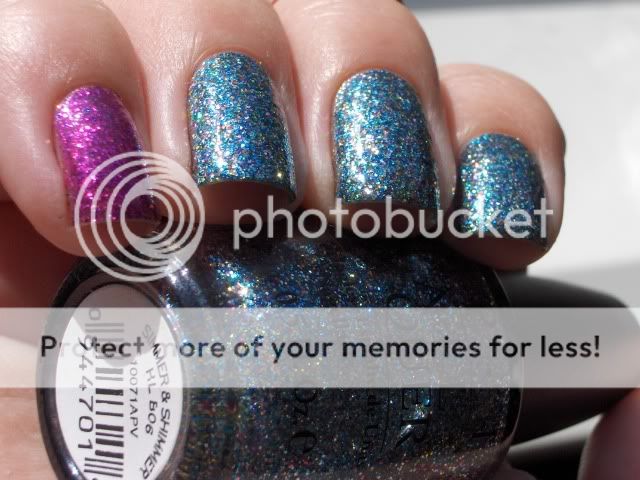
I loved this idea so I decided to use Simmer & Shimmer to do a mani myself. I used Viva la Diva #71 on my pinky.

Compared to Absolutely Alice, Simmer & Shimmer is a bit more silver and it has multi-colored glitters instead of just blue and gold. There is fuschsia, orange, yellow, green and gold which make it feel like a party in a bottle. Contrairy to what you might expect after that statement it is not an "in-your-face" glitter. Somehow OPI manages to make glitter polishes seem subdued and demure. Apart from it being glitter of course. lol
This is the sort of glitter polish I'm pretty sure wouldn't have caused my late grandmother to throw a hissyfit and kick me out of the house while yelling at me I was the whore of Babylon and believe me, my grandmother wasn't easily satisfied. Just kidding!
(No I'm not.)
Giant thumb!
Anyway, back to the polish! I did four coats of Simmer & Shimmer but honestly, that fourth coat was my paranoia kicking in. Macro setting and all.... I could see some of my bare nail through it if I looked closely but from a reasonable distance the glitter took care of that. On the pinky I used two coats of Simmer & Shimmer and two coats of Viva la Diva #71 because I wanted some of the blue glitter to shine through and pull the look together.
Drying time was short as can be expected from glitters. The surface was a little bumpy after the first coat of topcoat so I added a second one to make it smooth.
Removal was normal for glitters. A pain if you try to do it the old fashioned way but with the foil method it was a breeze! I did find some stray glitters on my hands (and on my face, my hair, my couche, the floor, and on boyfriend etc. lol) but that is just the price we have to pay for wearing awesome glitters.
Thanks for looking!
Als eerste een reminder om je in te schrijven voor mijn Surprise Puppy Giveaway om negen Catrice lakjes van jouw keuze te winnen!
Ik heb een klein beetje zon gehad en daar heb ik gebruik van gemaakt om een aantal shimmers uit de nieuwe Lente/Zomer collectie van Catrice te swatchen. Daarna liet de zon me in de steek dus de rest volgt nog maar daarvoor moet ik mijn lightbox uit de kast trekken.
First a reminder to enter my Surprise Puppy Giveaway to win nine Catrice polishes of your choice!
I had a little sunlight today so I used that to swatch a couple of shimmers from the new Spring/Summer Collection by Catrice. After that the sun failed me but the rest will follow, I just have to get out my light box for those.

Ik moet mijn eerdere opmerkingen over de formule van deze collectie terugnemen. Blijkbaar zijn de problemen die ik had met Poison Me, Poison You beperkt tot die ene lak want met de rest van de collectie heb ik geen problemen gehad. Alleen Sold Out For Ever was iets moeilijker maar dat is ook een pastel en die staan erom bekend.
Alle swatches zijn twee laagjes zonder basecoat of topcoat tenzij anders vermeld.
I have to retract my previous comments on the formula of this collection. I guess the problems I had with Poison Me, Poison You were limited to that polish alone because the rest of the collection gave me no trouble. Only Sold Out For Ever was a bit harder but that is a pastel and they are notorious for it.
All swatches are two coats without basecoat or topcoat unless otherwise stated.

Laat me je voorstellen aan Clay-ton, My Hero. Een greige (grijs/beige) met gouden shimmer en in sommig licht zelfs een zeegroene tint. Deze is zo mooi en delicaat!
Meet Clay-ton, My Hero. A greige (grey/beige) with gold shimmer and in some light it even has a sea-green tint. This one is so pretty and delicate!

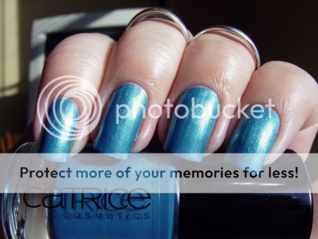
De volgende is Blue's Brother, een staalblauwe shimmer. Deze heeft zoveel shimmer dat ze grenst aan een foil. Niet helemaal mijn smaak maar het is wel een vrolijk zomerkleurtje dat ik me wel met leuke sandalen en een rokje zie dragen.
Next up is Blue's Brother, a steelblue shimmer. This has so much shimmer it borders on a foil. Not exactly my taste but it is a fun summer colour and I can see myself wearing it with cute sandals and a skirt.

Big Spender Wanted! Roze met gouden shimmer. Deze doet me denken aan China Glaze Strawberry Fields maar deze is koeler van kleur en heeft minder rood. Mooi, meisjesachtig en zomerig maar niet erg interessant vind ik. Als je nog niet zoiets hebt is deze de moeite waard om te kopen maar het is geen absolute must have.
Big Spender Wanted! Pink with a golden shimmer. This one reminds me of China Glaze Strawberry Fields but it's cooler toned and has less red. Pretty, girly and summery but not very interesting in my opinion. If you don't have something like it, it is worth buying but to me it's not a must have.

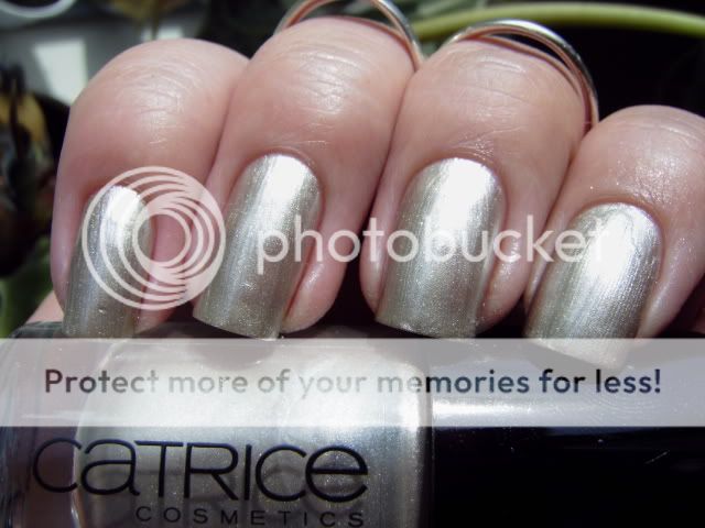
Be My Millionaire. Een mooie koele, antiek-uitziende gouden shimmer. Ik ben er vrijwel zeker van dat Catrice heeft geprobeerd Chanel Kaleidoscope te dupen met deze. Ik heb geen idee hoe goed ze hierin geslaagd zijn omdat ik niets vergelijkbaars heb maar van wat ik kan zien heeft Kaleidoscope grotere shimmerdeeltjes. De kleur lijkt echter wel in de buurt te komen.
Meer van deze collectie (inclusief mijn persoonlijke favorieten) volgen later!
Be My Millionaire. A pretty cool-toned antique-looking gold shimmer. I'm pretty sure Catrice tried to come close to Chanel Kaleidoscope with this one. I have no idea how close they came because I have nothing like it but from what I can see Kaleidoscope has bigger shimmer particles. The colour seems pretty close though.
More of this collection (including my personal favourites) later!

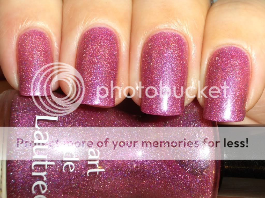
Het heeft hier weer de hele dag gesneeuwt. Heerlijk! Ik had dus mooi de tijd om wat swatches te doen. Dit is Art de Lautrec #13B. Een mooie roze met subtiel holo effect.
It has been snowing here all day. Great! This gave me the perfect opportunity to do some swatches. This is Art de Laurtec #13B. A nice pink with a subtle holo effect.

Dit is drie laagjes zonder topcoat omdat topcoat vaak het holo effect verminderd. De formule is een beetje vergelijkbaar met de China Glaze Kaleidoscope holo's maar iets minder korrelig.
This is three coats without a topcoat because topcoat can effect the holo. The formula is comparable to the China Glaze Kaleidoscopes but a little less gritty.

Art de Lautrec is in Nederland te koop bij Alice And Jo's Havesentials.
Thanks for looking!
Ik zag deze vanmorgen en ik kon ze niet laten liggen omdat ik geen enkele nude nagellak bezit.
Ik moet zeggen dat ik een beetje teleurgesteld ben door deze collectie. Catrice heeft normaal gesproken aardig goede nagellakken maar deze waren veel te doorzichtig en streperig.
English: I saw these this morning and I had to pick them up because I don't own any nude polishes.
I must say I was a bit dissapointed by this collection. Catrice usually has some pretty good polishes but there were way to sheer and streaky.

01 Nude Cream. Een melkwitte jelly. Ik heb vier laagjes gedaan en er zijn nog steeds kale plekken maar ik weiger meer dan vier laagjes te lakken van welke lak dan ook.
English: 01 Nude Cream. A milky white jelly. I did four coats and I still have bald spots but I refuse to do more than 4 coats with any polish.

02 Soft Coral. Een doorzichtige babyroze. Ik vind de kleur wel mooi ondanks dat het niet iets is dat ik normaal gesproken draag. Ook nu had ik weer vier laagjes nodig en ze zou nog wel een of twee laagjes kunnen gebruiken.
English: 02 Soft Coral. A sheer baby pink. I like the colour on this one even though it's not something I would normally wear. Again I needed four coats and it could have used one or two more to cover streaks and bald spots.

03 Coral Pink. Dit is inderdaad een koraalroze! Ik weet niet wie besloten heeft dat koraal een goede nude zou zijn maar als iets op mijn lichaam deze kleur had zou ik me ernstig zorgen maken... Eerlijk gezegd vind ik deze echt afschuwelijk bij mijn huidskleur.
Deze had drie laagjes nodig en was wat makkelijker te lakken dan de andere twee. Misschien omdat ze meer pigment heeft?
English: 03 Coral Pink. Oh it's coral alright! I don't know who decided coral would make a good nude but I would be seriously concerned if anything on my body had this colour... Honestly I think this one looks hideous on me.
This is three coats and this one applied a lot better. Maybe this has more pigment?

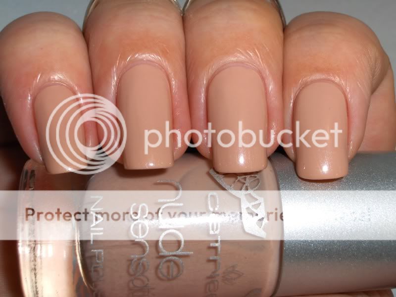
04 Nude Beige. De naam zegt het al. Ze hebben het beste voor het laatst bewaard bij deze collectie. Deze vind ik erg mooi! Dit is drie laagjes. De applicatie was wederom een stuk beter dan de eerste twee. Mooi gelijkmatige laagjes en niet zo streperig.
Ik had wel een vergelijking willen doen met al deze lakjes maar ik heb alleen iets in mijn collectie dat een beetje op Nude Beige lijkt.
English: 04 Nude Beige. The name says it all. They saved the best for last with this collection. I really like this one! This is three coats. Application was a lot better than the first two. Nice even coats with minimal streaking.
I would have done a comparison of all colours in this collection if I had any but I only had something simmilar to Nude Beige in my collection.

Nude Beige op wijsvinger en ringvinger, Orly Country Club Khaki op middelvinger en pink.
Vergeleken met Nude Beige lijkt de Orly echt een grijs terwijl dat helemaal niet het geval is als je haar op zichzelf ziet.
English: Nude Beige on index and ring finger, Orly Country Club Khaki on middle finger and pinky.
Compared to Nude Beige the Orly looks positively grey which isn't the case at all if you see it on it's own.
Samenvattend: deze kleuren zijn niets voor mij en ik ben blij dat ik daar achter ben gekomen met nagellak van €1,99 in plaats van Essies van €14,-. Ach, ik kan ze altijd nog frankenen.
Bovendien is het best raar dat ze een kleur als koraalroze er wél in stoppen maar dat er geen nude voor donkere mensen in zit. Niemand is koraalroze Catrice! Maar meer dan de helft van deze wereld heeft een andere kleur dan deze lichte kleuren.
Dus ja, baggercollectie.
English: All in all, these colours are not for me and I'm glad I found that out with €1,99 polishes instead of €14,- Essies. I guess I could always franken the lot.
To top that off it's pretty strange that they do add a colour like coral but not a nude for dark-skinned people. Nobody's skin is coral Catrice! But more than half the population of this world has a different colour that these pasty polishes.
So yeah, sucky collection.
Dit is Catrice Vibrant Violet. Twee laagjes zonder topcoat. Oh wat houd ik van Catrice! Hoe kan een 2 euro nagellak zo'n goede kwaliteit hebben? Geweldig gepigmenteerd, goed kwastje, het enige nadeel is het beperkte assortiment kleuren.
English: This is Catrice Vibrant Violet. Two coats without topcoat. Oh how I love Catrice! How is it possible that a 2 euro polish is such a good quality? Incredibly pigmented, good brush, the only downside is the limited assortment of colours.

Het was heel moeilijk deze op de foto te krijgen. Zo'n lastige kleur! Op geen van de foto's wordt de juiste kleur weergegeven. In het echt is ze veel mooier maar jullie zullen het hiermee moeten doen.
English: This was such a difficult colour to photograph! None of the pics are colour accurate. She is much prettier in person but this will have to do.











.JPG)


15